How to design a logo

Design can be challenging. I can see an idea in my mind, but I can’t always express it how I want to. This is one of the reasons why I decided to stop designing professionally. When someone is paying you to express an idea, it can add more pressure, and for me, it took the fun away from the process.
So now, I only design for my own personal projects because, in theory, this would be easier and less stressful.
Nope!
I am my worst critic, and when I am the one I need to make happy, let’s just say I am a lousy client. So, needless to say, I have been avoiding creating branding around my freelance work.
Define expectations
In the first design phase, we must ask questions and explore ideas. Learn the who, what, and why’s of the design.
Mood Board
An exercise that helps define the idea is a mood board. Gather all the examples that inspire you and put them in a single document. This document can be used as a reference while you explore ideas and try different designs.
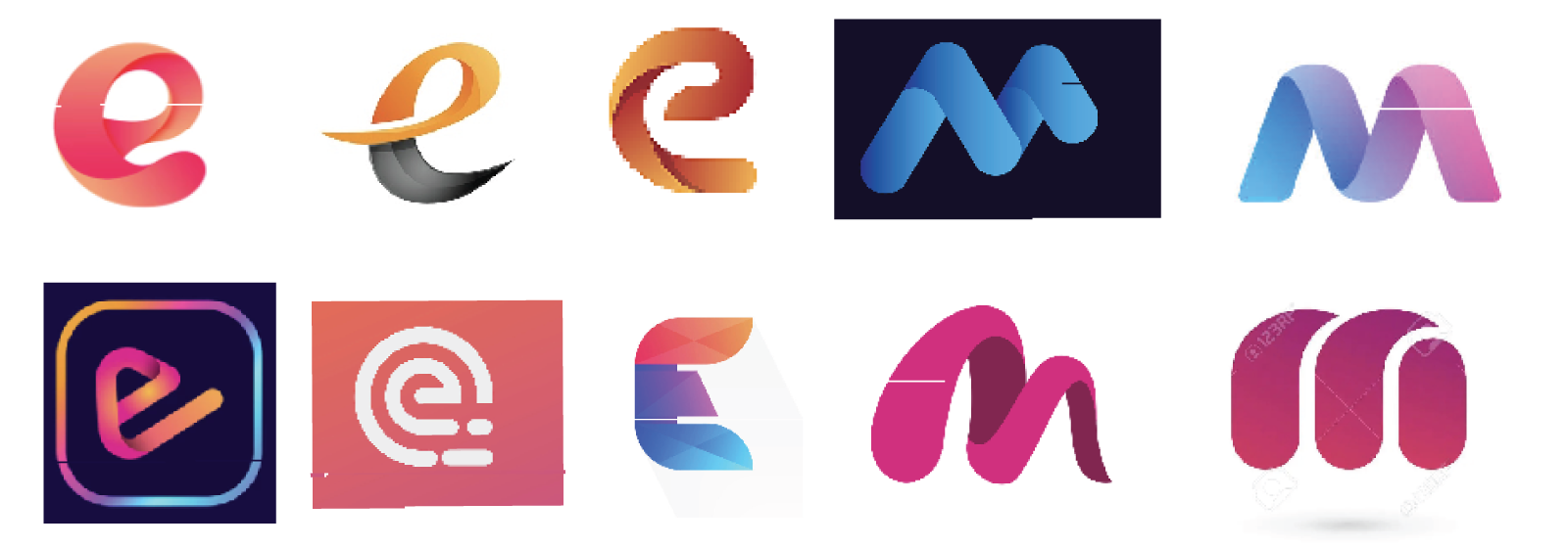
A collection of logos I found that matched the style I was looking for.
Rough Sketches
Sketch out your idea in as many ways as possible. A blank page is your enemy. You must defeat it with a pencil on paper. Don’t let your ego block you. Even if you think the idea is stupid, attempt to make a rendering of it. You might find inspiration that could spin you in a new direction. It’s always good to look back through your sketches to find patterns or holes in your ideas.
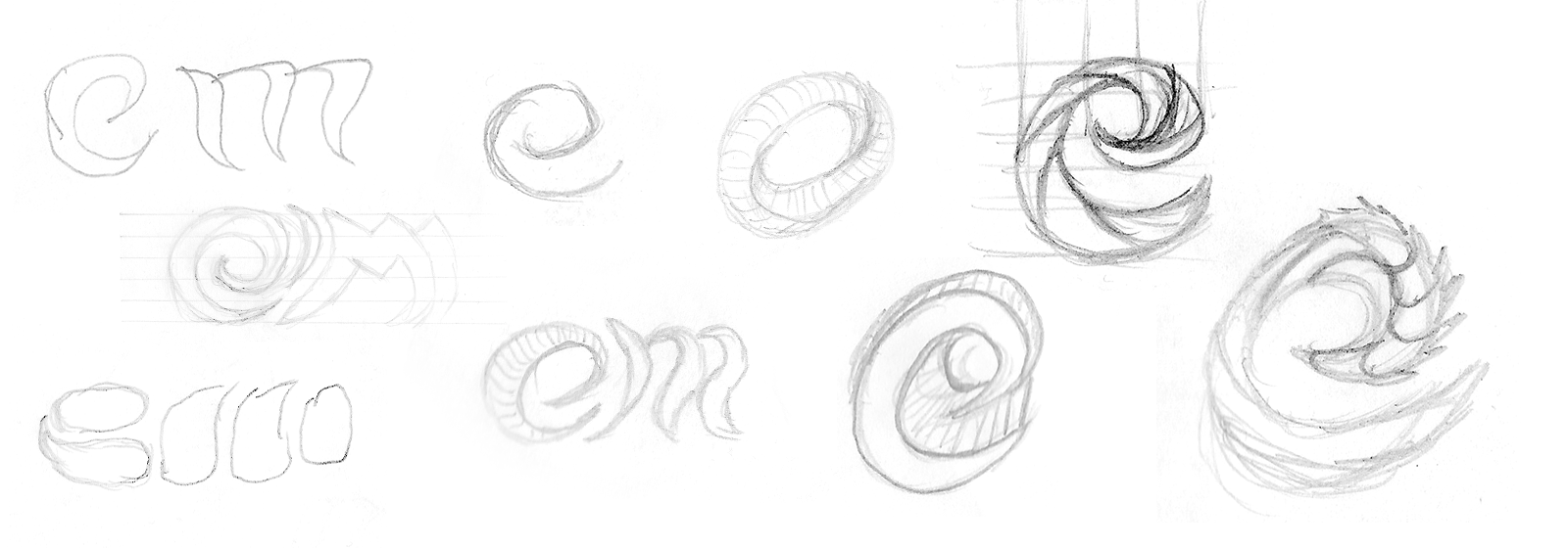
Sketches showing the evolution of the logo idea.
Build a mockup
In this phase, we need to mold our ideas into a single better-defined vision. So review your sketches and mood board a lot during this phase. They should serve as a reference point if you feel lost.
Color Swatches
While in the first phase of design, I avoid color. Adding color too early can complicate the exploration of ideas. I try to slowly sprinkle color concepts into the design, starting with sample swatches of colors.
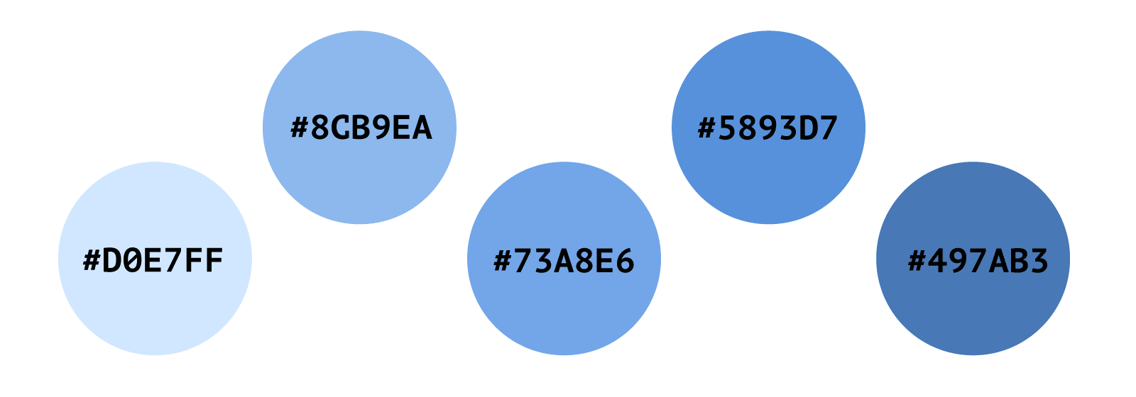
Color swatches for logo design.
Inked sketches
A step above your rough sketches but with more emphasis on form. I like to use a felt tip ink pen over my sketches to give a more defined shape to an idea. This is where I define any detail I avoided while roughing out the idea.
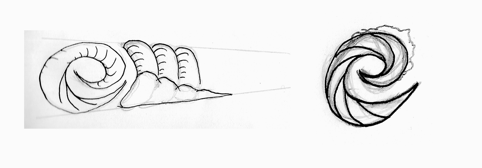
Sketches with ink for detail.
Rendering
This is where I take my idea into a graphics program. For a logo, I prefer to use Adobe Illustrator. Also, I might explore color here with shades of grey. By this time, I am usually only exploring a few ideas.
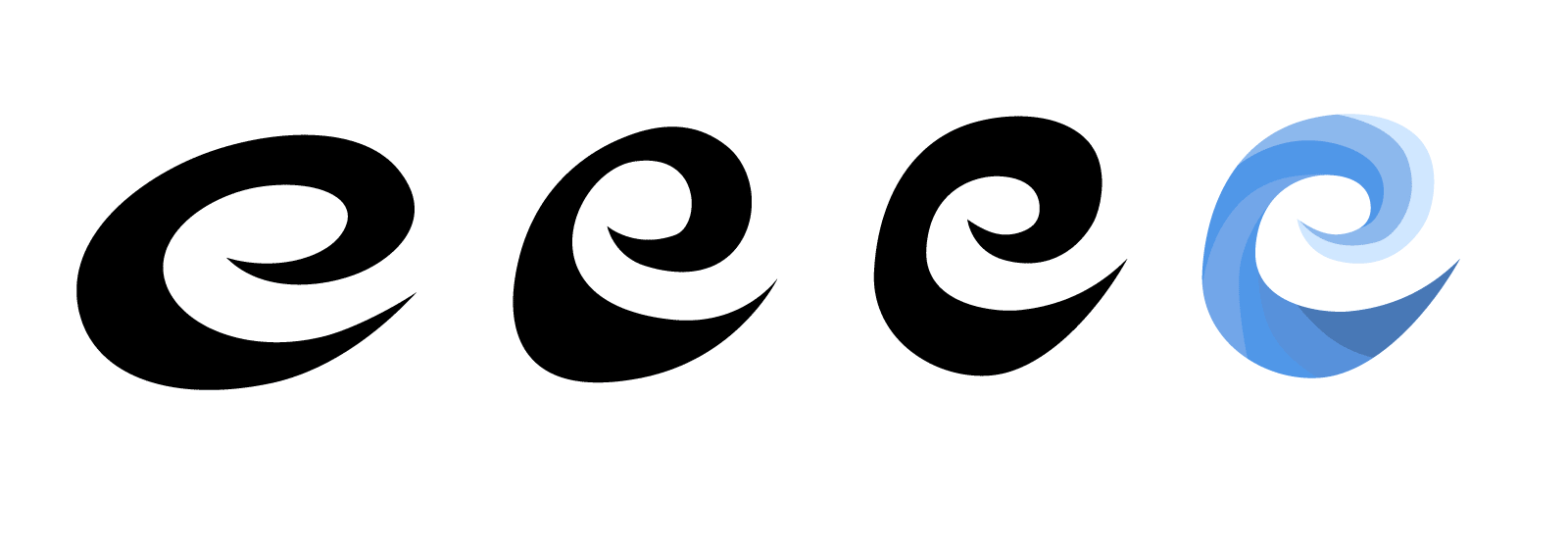
Exploring the shape of the letter E.
I prefer using a tool like Adobe Illustrator because of the vector pen tools. Vector graphics are great for making crisp edges regardless of size. Also, when exploring an object’s shape, vector tools are great for making quick adjustments. These tools can be tricky to learn but can give you awesome results.
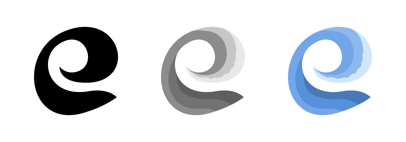
Adding color detail to the final logo shape.
Wrapping up
Congrats, you now have a logo. But there are just a few small steps to take to wrap up. To make using the logo quick and easy, you must export a few ready-to-use graphic files. These files should be a mix of raster and vector graphics and in single and multi-color.
Final logo design!
Conclusion
This post just skims the surface of the design process, but I feel these are the basic building blocks for all design. I am pleased with the outcome of my logo, so maybe I am not such a bad client after all.